This comment refers to both this and the other character you posted.
You've got some good design ideas in both. Because you're doing characters for these, you'll need to approach this a little differently than normal.
Characters read better, especially when animated, if they have gradients on them. The face and chest should be brighter to draw attention upwards to the face. The ends of the arms and legs and the hands and feet should be darker or a different color, this helps separate the limbs into parts when animated for visual clarity. In your case, since your characters are clothed, the sleeves and pants/robes should have gradients.
Besides adding gradients, add some color variation, including in the face. It doesn't have to be drastic, it's just feeling a little flat right now, especially when I compare it to some of your other work you've shown me. Go back to the concepts you've done with character and ask yourself what is and isn't working in each. It'll be a little bit of a challenge to apply it to a texture sheet if you haven't done many characters before since the medium is so different. Keep looking at your final piece objectively, or even give yourself a paint over to see where you want your style and art to go. Even if you never do another character again in your career, this is a good opportunity for you to self-crit your own work. =)
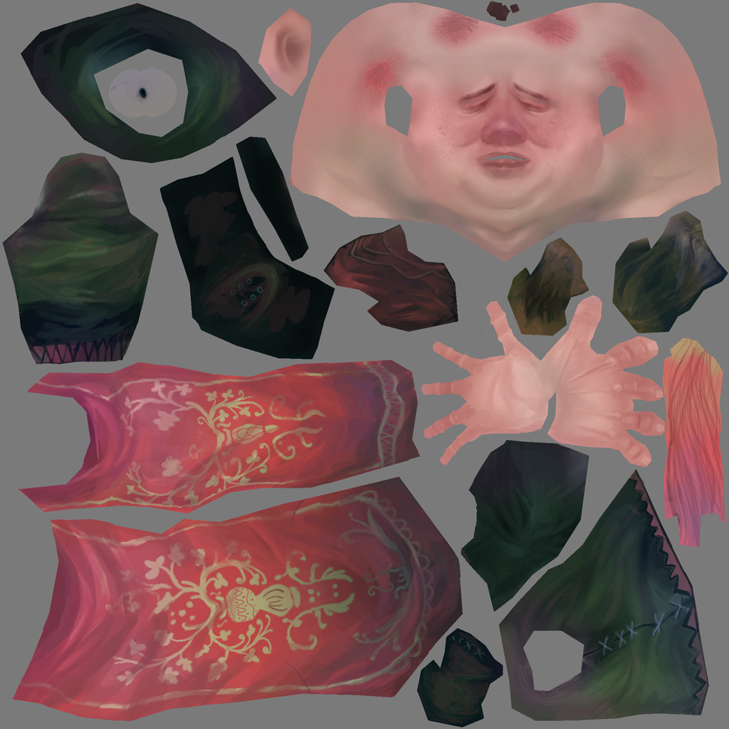


This comment refers to both this and the other character you posted.
ReplyDeleteYou've got some good design ideas in both. Because you're doing characters for these, you'll need to approach this a little differently than normal.
Characters read better, especially when animated, if they have gradients on them. The face and chest should be brighter to draw attention upwards to the face. The ends of the arms and legs and the hands and feet should be darker or a different color, this helps separate the limbs into parts when animated for visual clarity. In your case, since your characters are clothed, the sleeves and pants/robes should have gradients.
Besides adding gradients, add some color variation, including in the face. It doesn't have to be drastic, it's just feeling a little flat right now, especially when I compare it to some of your other work you've shown me. Go back to the concepts you've done with character and ask yourself what is and isn't working in each. It'll be a little bit of a challenge to apply it to a texture sheet if you haven't done many characters before since the medium is so different. Keep looking at your final piece objectively, or even give yourself a paint over to see where you want your style and art to go. Even if you never do another character again in your career, this is a good opportunity for you to self-crit your own work. =)